Frederick Hammersley's Art Against the Machine
Posted on Thu., May 12, 2016 by
The painter's computer-generated drawings were groundbreaking and playful

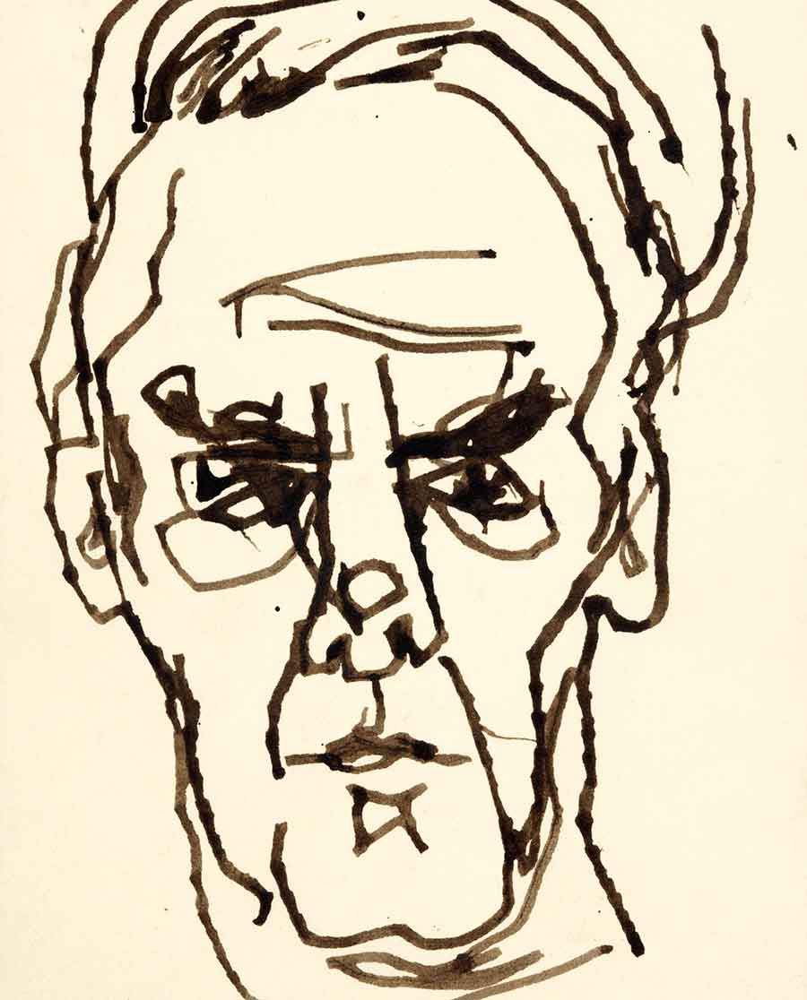
Frederick Hammersley, sure, 1980. Ink on paper. Gift of the Frederick Hammersley Foundation. The Huntington Library, Art Collections, and Botanical Gardens. Image © Frederick Hammersley Foundation.
Born in Salt Lake City, Utah, Frederick Hammersley (1919–2009) studied at Chouinard Art Institute (now CalArts) and taught at Southern California institutions from 1948 to 1968, when he moved to New Mexico. A focused Huntington exhibition curated by James Glisson, Frederick Hammersley: To Paint without Thinking (Oct. 2017 to Jan. 2018), will look at Hammersley's lifelong preoccupation with creating art from sets of instructions and rules, and, in particular, his encounter with computer-generated art during the late 1960s.
Frederick Hammersley first came into prominence as one of the four artists in Jules Langsner's landmark exhibition Four Abstract Classicists (1959), which began in San Francisco and then traveled to Los Angeles, Belfast, and London. Along with John McLaughlin, Karl Benjamin, and Lorser Feitelson, Hammersley offered an alternative to the lush, gesturally expressive art of the Abstract Expressionists, such as Jackson Pollock and Willem de Kooning. With their machine-like precision and titles that rely on wordplay, Hammersley's geometric paintings are not about physical or emotional intensity, like the works of Abstract Expressionists; nor are they austere, like the paintings of John McLaughlin.
While The Huntington in the past had generally not collected post-war American art, the gift of Andy Warhol's Small Crushed Campbell's Soup Can (Beef Noodle) (1962) from the estate of Robert Shapazian in 2010 and subsequent gifts from an anonymous donor in honor of Shapazian have significantly enlarged this area of the collection. Hammersley's See saw was one of those gifts. When I was consulting the artist's papers at the Getty Research Institute, it became apparent that a complex set of rules and procedures were used to generate See saw's deceptively simple composition. To understand Hammersley's art fully, one needs to know something about his system, and The Huntington's exhibition Frederick Hammersley: To Paint without Thinking (Oct. 2017–Jan. 2018) will pair finished works in various mediums with archival materials to elucidate his procedures for generating compositions.

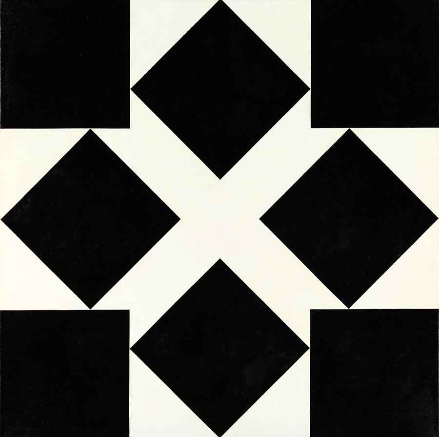
Frederick Hammersley, See saw, 1966. Oil on linen. Anonymous gift in memory of Robert Shapazian. The Huntington Library, Art Collections, and Botanical Gardens. Image © Frederick Hammersley Foundation.
Early in my research for the exhibition and accompanying book-length catalogue, it became clear to me that Hammersley's Computer Drawings, created in 1968 and 1969 when he taught at the University of New Mexico, were not outliers but central to unraveling his art's complexity. After 20 years as an artist who had experimented with rules, Hammersley happened upon a purely rule-based medium, computer art. (After all, a computer program is nothing more than a set of instructions for a computer.) Their indispensable role as windows onto his arcane working process and their importance for the exhibition surely factored into the Frederick Hammersley Foundation's decision to give The Huntington 75 computer drawings, as well as 30 additional drawings and a rare sculpture—a total of 106 objects. As a result of this extraordinary generosity, The Huntington now has broad and representative coverage of Hammersley's work.
Even though Hammersley used rules and procedures to create his art, neither See saw nor JELLY CENTERS have the tone of schematic engineering diagrams, much less paint-by-number demonstrations. They are zany. They follow rules and break them. See saw, for example, visually flips back and forth. First the black diamonds in the center assert themselves, and then they recede as the squares in the corners jump forward. With only two colors and two sets of four congruent squares set at 45-degree angles to one another, See saw has the laconic austerity of a Euclidean geometric construction, yet the toggling of the sets of squares makes it into a kinetic illusion, which the work's title references. The inability of geometry, with its timeless axioms about right angles and circles, to accommodate everyday human perception—the squares are obviously not really moving—speaks to the problem of order and disorder, about systems and when they break down. No system, no set of rules, no protocol can work in every instance in the real world: machines break, unpredictable situations arise, rules turn out to be unworkable, and humans get fed up and revolt.

Left: Frederick Hammersley, JELLY CENTERS, 1969. Computer-generated drawing. Gift of the Frederick Hammersley Foundation. The Huntington Library, Art Collections, and Botanical Gardens. Image © Frederick Hammersley Foundation. Center: Frederick Hammersley, . ROTISSERIE ., 1969. Computer-generated drawing. Gift of the Frederick Hammersley Foundation. The Huntington Library, Art Collections, and Botanical Gardens. Image © Frederick Hammersley Foundation. Right: Frederick Hammersely, TEA TALK, 1969. Computer-generated drawing. Gift of the Frederick Hammersley Foundation. The Huntington Library, Art Collections, and Botanical Gardens. Image © Frederick Hammersley Foundation.
In the late 1960s, Hammersley left Los Angeles to take a teaching position at the University of New Mexico, where the artist Katherine Nash and computer scientist Richard Williams collaborated to make ART 1, among the first programs anywhere designed to be used by visual artists. When I interviewed Williams, he recalled teaching art students and Hammersley how to punch cards to create shapes, which required following an exacting set of instructions. A misplaced punch could cause an error. The punch cards were then run through an IBM 360/40 mainframe, and the output was printed on a high-speed IBM 1403 printer. Like a typewriter, the 1403 could print only letters, numbers, punctuation, and a limited range of symbols, including #, &, and *. The matrix for the image was 50 rows x 105 columns. Additionally, ART 1 could double print characters to make them bold or cause different characters to be printed on top of each other, say A over B. ART 1 could form these characters into a small range of shapes: rectangles, triangles, ellipses, circles, and curves generated by a logarithmic function.

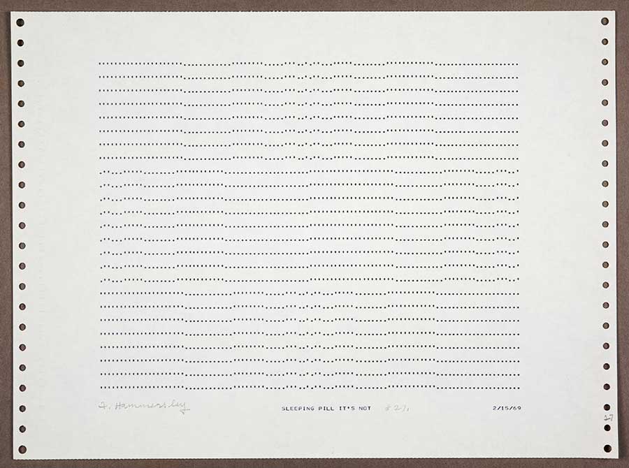
Frederick Hammersley, SLEEPING PILL IT'S NOT, 1969. Computer-generated drawing. Gift of the Frederick Hammersley Foundation. The Huntington Library, Art Collections, and Botanical Gardens. Image© Frederick Hammersley Foundation.
Within this constricted set of options, Hammersley made a surprising range of shapes and patterns, as the Computer Drawings at The Huntington demonstrate. While many mimic his paintings, they lack solid color blocks; rather, the drawings are diaphanous—light gray veils layered across the page. Hammersley's calling them "drawings" is significant—the easy explanation is that he followed the lead of Nash and Williams, who in a 1970 essay also called the printed output of ART 1 "drawings." However, I think Hammersley is signaling their experimental nature. After all, he could have called them "prints," since they were made on a printer. As with an engraving or woodcut, multiple identical copies could be made easily: just feed the punch card through the IBM 360/40 and out pops another batch. A print—whether a cheap poster, an engraving, or a photograph—is assumed not to be unique. More to the point, drawing is the medium par excellence for artistic experimentation. Pencil and paper in hand, an artist sketches, erases, turns the page clockwise, flips the page over, and starts again. He also pushes against the mechanical nature of the computer drawings. Even if they lack the stray marks and wavering lines left by an errant human hand, they are still fashioned by an artist. As if to remind us that he made these drawings, Hammersley signed each of the 75 prints in The Huntington's series.

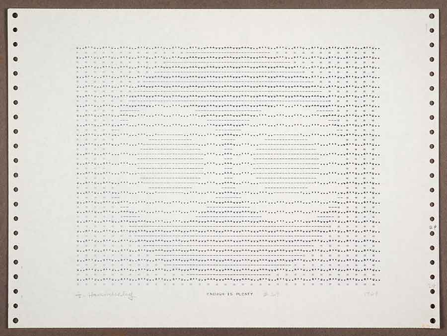
Frederick Hammersley, ENOUGH IS PLENTY, 1969. Computer-generated drawing. Gift of the Frederick Hammersley Foundation. The Huntington Library, Art Collections, and Botanical Gardens. Image © Frederick Hammersley Foundation.
Logic, the ability to follow instructions to the letter, and the willingness to learn through trial and error were needed to produce the Computer Drawings. This is not exactly the skill set required to be a draftsman. However, throughout his life—to keep his eye sharp and his hand dexterous—Hammersley drew figures and portraits, and the Frederick Hammersley Foundation's gift includes a broad selection of accomplished drawings. There is a red-and-black-chalk anatomical study, an exquisitely simple sketch of what might be a geranium leaf, and a delicately rendered boy's head, a copy from an Old Master painting. One consistent subject over the years was the artist himself, and The Huntington owns a handful of self-portraits that range from an emphatic line study to a demented ink sketch to a ballpoint pen drawing in which his features emerge from a fog of scribble. In all of them, however deliberately infantile or fuzzy, Hammersley's long face and broad forehead stand out.
The titles of works—such as See saw, SLEEPING PILL IT'S NOT (1969), ENOUGH IS PLENTY (1969), and JELLY CENTERS (1969)—play with words and, as you may have noticed, the rules of capitalization. The paintings' titles have only the first word capitalized, as if each title were a sentence or a phrase. The Computer Drawings' titles are all capitals, consistent with the limitations of the IBM printer. The eccentric capitalization is a friendly reminder of the importance of the titles and the care Hammersley took in selecting them.

Left: Frederick Hammersley, untitled, 1941. Ink, conte, and graphite on paper. Gift of the Frederick Hammersley Foundation. The Huntington Library, Art Collections, and Botanical Gardens. Image © Frederick Hammersley Foundation. Center: Frederick Hammersley, untitled, 1974. Graphite on paper. Gift of the Frederick Hammersley Foundation. The Huntington Library, Art Collections, and Botanical Gardens. Image © Frederick Hammersley Foundation. Right: Frederick Hammersley, copy, 1974. Pencil on paper. Gift of the Frederick Hammersley Foundation. The Huntington Library, Art Collections, and Botanical Gardens. Image © Frederick Hammersley Foundation.
In some instances, the titles match the image. JELLY CENTERS contains squishy lozenge shapes that could be jellybeans or jelly-filled doughnuts. In other instances, the title refers to its own subject. The two periods on either side of the title . ROTISSERIE . (1969) are like the ends of a spit driven through the word. Imagine the word as a piece of meat rotating. Other titles, however, have no obvious descriptive meaning. SLEEPING PILL is definitely not any kind of pill, sleeping or otherwise. Another series is titled TEA TALK, which seems like a mismatch of "tea time" and "coffee talk." Its graduated blocks of gray, like a bar chart, have no relationship to talk or tea or their combination. ENOUGH IS PLENTY vaguely resembles a stylized face with two owlish eyes staring out, and the phrase, on reflection, melts into a puddle of nonsense. Enough is enough, but plenty is usually more than enough, right? Or not? Hammersley is pulling our legs and chipping away at the conventional understanding of a title as explicating an artwork's subject matter or meaning.
By calling them drawings, signing them, and adding witty titles, Hammersley humanizes machine-made computer printouts. During the 1960s, the possibilities for computer technology were seen as literally endless and only decades away. While some of this was utopian—take The Jetsons (original broadcast 1962–63) or Star Trek (original broadcast 1966–69) with their labor-saving gadgets—other visions of a computerized future were horrific. Perhaps most famously, HAL 9000, the homicidal sociopath computer in Stanley Kubrick's film 2001: A Space Odyssey (1968), murders some of the crew before the protagonist, Dr. David Bowman, shuts it down by removing the CPU boards from their cooling tank. One of the film's motifs is that HAL, as the computer is called, is infallible, unlike the astronauts. Albeit in radically different ways, 2001, an epic about misplaced human trust in the efficacy of technology, and the Computer Drawings, with their wry sensibility, both address an awkward fit between computer systems and flesh-and-blood, error-prone human beings.

Left: Frederick Hammersley, untitled, 1974–80(?). Ballpoint pen on computer paper. Gift of the Frederick Hammersley Foundation. The Huntington Library, Art Collections, and Botanical Gardens. Image © Frederick Hammersley Foundation. Center: Frederick Hammersley, light switch, 1988. Lithograph. Gift of the Frederick Hammersley Foundation. The Huntington Library, Art Collections, and Botanical Gardens. Image © Frederick Hammersley Foundation. Right: Frederick Hammersley, like it, 1978. Ink on paper. Gift of the Frederick Hammersley Foundation. The Huntington Library, Art Collections, and Botanical Gardens. Image © Frederick Hammersley Foundation.
Despite the user-friendly graphic interfaces of today's computers, we know the computer is the boss, and we adjust to its constraints. (Try making it do something it isn't programmed to do, and you discover who's in charge.) When Hammersley worked with ART 1 to make the drawings now at The Huntington, he could operate only within the program's protocols. Yet the artist, who turned the rules of geometry into something playful in his paintings, impishly subverted the computer's rigidity in his Computer Drawings. An IBM mainframe may have produced the drawings, but only a human could appreciate their lace-like patterns and humorous titles.
James Glisson is the Bradford and Christine Mishler Assistant Curator of American Art at The Huntington.